

Most IT reporting drowns leaders in numbers that never answer the only question that matters: is technology helping the business or holding it back? The fix is not more dashboards. It is knowing the difference between a KPI, which tells you how IT is performing right now, and an OKR, which sets a specific change you want to drive. Get that distinction right and a short, honest scorecard replaces a wall of noise. This guide explains both, shows real IT examples of each, and gives you a five-step method to choose the handful of metrics that are actually worth watching.
Before You Begin
You do not need special software to start, but you will get further if you have a few things in place:
- A clear business objective for the quarter that IT is meant to support (this drives everything else).
- Access to your operational data: a ticketing or help desk system, a monitoring or RMM tool, and your IT budget.
- One accountable owner for reporting, whether an internal IT lead or a Virtual CIO.
- About two hours to draft your first metric set, then a recurring monthly and quarterly review.
- Skill level: business decision-maker. No technical background required to set the direction.
- KPIs measure the present; OKRs drive the future. A KPI is a health gauge you watch continuously. An OKR is a goal with a deadline that changes a number on purpose.
- They work together, not against each other. An off-target KPI becomes next quarter’s OKR, and a completed OKR result settles back into a KPI you monitor.
- The cost of not measuring reliability is real. For more than 90% of mid-size and large enterprises, a single hour of downtime now exceeds $300,000, according to ITIC’s 2024 survey.
- Fewer, better metrics win. Two to four indicators per area of IT beats a dashboard of forty that nobody reads or acts on.
- Ownership is the missing piece. Metrics only matter when someone is accountable for reporting them and acting on them, which is the core job of a Virtual CIO.
What’s in This Guide
- OKRs vs. KPIs: The Core Difference
- Why IT Teams Measure the Wrong Things
- How to Choose and Set the Right IT Metrics
- IT KPI Examples That Actually Matter
- IT OKR Examples for Common Business Goals
- When to Call a Professional
- Troubleshooting: Common Metrics Mistakes
- Maintain and Monitor Your Metrics
- Frequently Asked Questions
OKRs vs. KPIs: The Core Difference
The confusion between OKRs and KPIs is not academic. It leads teams to set vague goals with no way to prove progress, or to collect metrics that describe activity without ever moving the business. The distinction is simple once you see it.
A KPI, or key performance indicator, is a single metric that tells you how something is performing right now. System uptime, average ticket resolution time, and IT spend as a share of revenue are all KPIs. You watch them continuously, and a healthy KPI is one that stays inside an acceptable range. KPIs are, in effect, the gauges on your dashboard.
An OKR, or objective and key results, is a goal-setting framework, not a single number. It pairs an Objective (a qualitative statement of what you want to achieve) with two to four Key Results (the measurable outcomes that prove you achieved it). The framework was developed by Andy Grove at Intel in the 1970s and later brought to Google in 1999 by investor John Doerr, who popularized it in his book on the method. Where a KPI monitors, an OKR mobilizes: it names a change and puts a deadline on it.
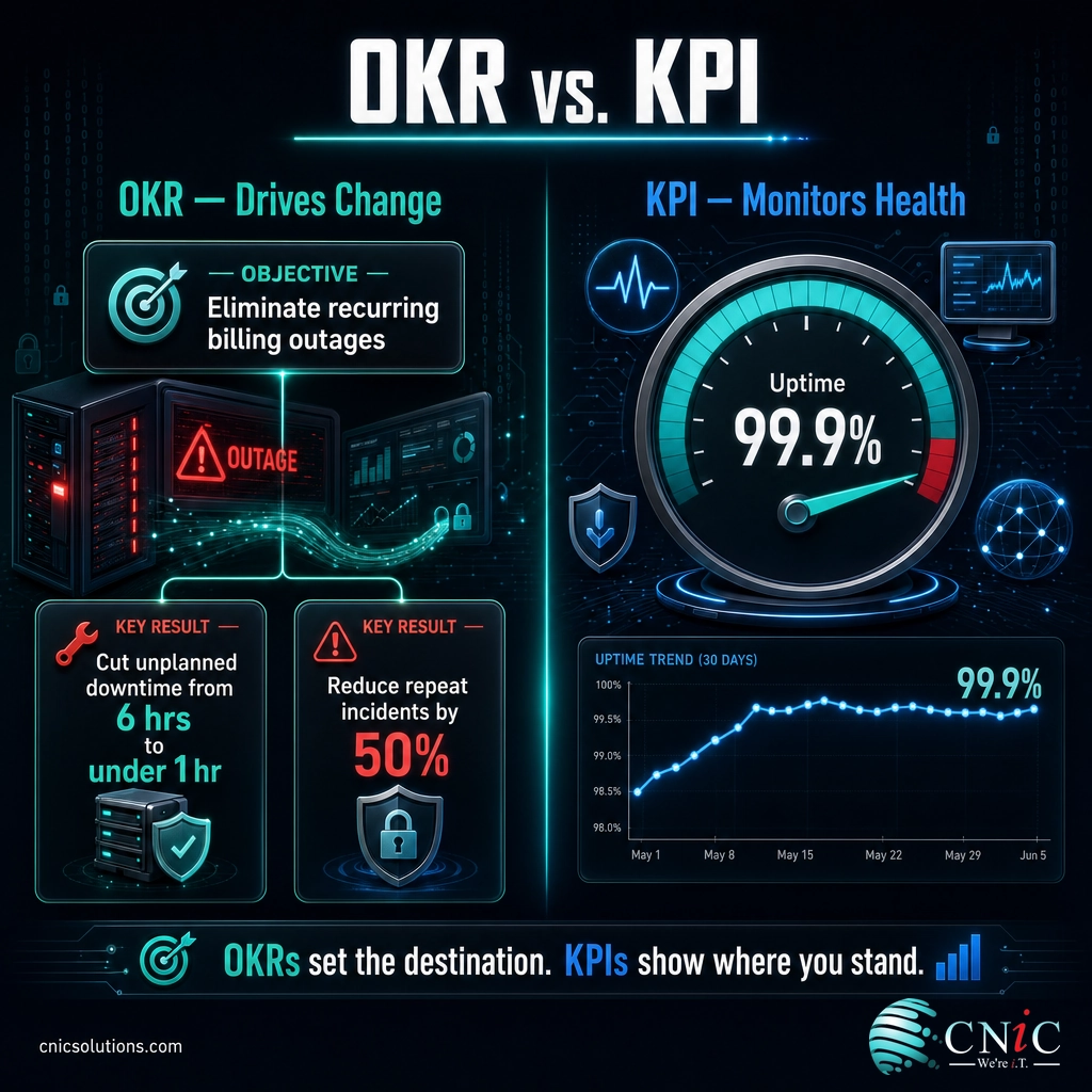
Here is how the two compare across the attributes that matter when you are deciding which to use.
| Attribute | KPI (Key Performance Indicator) | OKR (Objectives & Key Results) |
|---|---|---|
| What it is | A single metric | A goal-setting framework (Objective + Key Results) |
| Question it answers | How are we performing right now? | What do we want to change, and did we? |
| Time horizon | Ongoing, continuous | Fixed period, usually a quarter |
| Indicator type | Lagging: reflects past performance | Leading: aims at a future state |
| Target | Stay within a healthy range | Stretch toward an ambitious outcome |
| Example | Uptime held at 99.9% | Objective: eliminate recurring billing outages. Key Result: cut unplanned downtime from 6 hours to under 1 hour this quarter. |
The most important point is that OKRs and KPIs are not rivals. They are two views of the same measurement system. A KPI that slips out of range becomes the natural subject of your next OKR. Once that OKR is achieved, the improved number settles back into a KPI you monitor from then on. You use KPIs to know where you stand and OKRs to decide where to push.
Source: What Matters, the Andy Grove and Intel OKR origin story
Why IT Teams Measure the Wrong Things
Given how clear the distinction is, why do so many IT scorecards fail to tell leaders anything useful? Because they measure what is easy to count instead of what changes a business decision. A monthly report can be full of numbers, tickets closed, emails processed, servers patched, and still leave the owner with no idea whether IT is a strength or a liability.
The stakes of measuring the wrong things show up most sharply in reliability. Downtime is not an abstract IT concern; it is a direct hit to revenue, and the figures are stark.
Independent research agrees on the scale of the problem. In the Uptime Institute’s 2024 outage analysis, more than half of organizations said their most recent significant outage cost more than $100,000, and one in five said it cost more than $1 million.
Cost of the Most Recent Significant Outage (Uptime Institute, 2024)
Share of organizations reporting each cost band for their most recent serious, severe, or significant outage. Source: Uptime Institute Annual Outage Analysis 2024.
If a number that size can hinge on IT performance, then reliability metrics belong on the leadership scorecard, not buried in an engineer’s console. The problem is not that IT teams lack data. It is that the data rarely connects to a business outcome. That is exactly the gap the OKR and KPI split is meant to close: KPIs keep the vital signs visible, and OKRs put deliberate pressure on the ones that are hurting the business.
Myth: more metrics means better visibility. The opposite is usually true. A dashboard with forty numbers hides the five that matter, and a report nobody reads to the end changes no decisions. Vanity metrics, the ones that only ever go up and never trigger an action, are worse than useless because they create a false sense of control. If you cannot name the decision a metric informs, cut it. A short scorecard that leadership actually reads beats an exhaustive one that gets skimmed.
Source: ITIC 2024 Hourly Cost of Downtime Report | Uptime Institute Annual Outage Analysis 2024
How to Choose and Set the Right IT Metrics
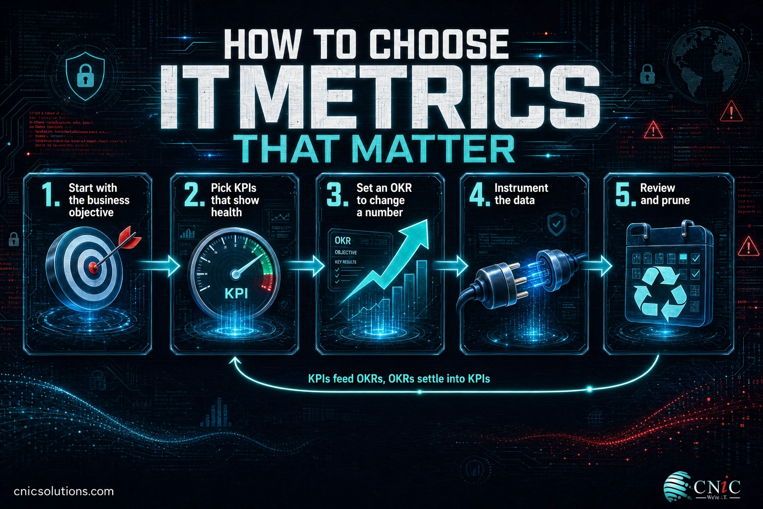
This is the practical core of measuring what matters. The method works whether you run IT in-house or through a provider, and it deliberately starts with the business, not the technology. Follow the five steps in order.
1Start With the Business Objective, Not the Metric
Before you name a single number, write down the business outcome IT is meant to support this quarter. “Reduce disruptions to our billing system,” “onboard new hires faster,” or “pass our upcoming security audit” are all valid starting points. The objective sets the direction; the metrics only exist to prove you moved in it. Teams that skip this step end up measuring what their tools happen to report rather than what the business needs.
What success looks like: a one-sentence objective a non-technical owner would recognize as important.
2Pick the KPIs That Show Ongoing Health
For each area of IT you are responsible for, choose two to four steady-state indicators you will watch every month. These are your gauges. For reliability that might be uptime and mean time to restore; for the help desk, first-level resolution rate and average resolution time; for security, patch compliance and phishing-test failure rate. Resist the urge to track everything. The goal is a set small enough that a busy owner will actually read it.
What success looks like: a short list of KPIs, each with a target range and a clear owner.
3Set an OKR Where You Need to Change a Number
KPIs tell you where you stand. When one is off target, or a new business goal demands improvement, turn it into an OKR. Write an Objective that states the change in plain language, then attach two to four Key Results that are specific and measurable. Good Key Results name a number and a direction: “cut average resolution time from 9 hours to 4,” not “improve support.” One to three active OKRs is plenty for most businesses at a time.
Common mistake: writing Key Results that are really just tasks (“migrate to a new ticketing system”). A task is something you do; a Key Result is a measurable outcome you achieve. “Deploy the new tool” is a task. “Raise first-level resolution to 80%” is a Key Result. If your Key Result has no number, rewrite it.
What success looks like: an Objective plus measurable Key Results, each tied to a KPI you already track.
4Instrument the Data So It Collects Itself
A metric you have to tally by hand will be wrong within a month and abandoned within two. Connect each number to a system that captures it automatically: uptime and mean time to restore from your monitoring or RMM platform, resolution rates from your ticketing system, patch compliance from your endpoint management tool. Automatic collection is what makes a metric trustworthy enough to base a decision on.
What success looks like: every metric on your scorecard has a source system, not a spreadsheet someone updates from memory.
5Review on a Fixed Cadence and Prune
Metrics decay. Review KPIs monthly to catch drift early and OKRs quarterly to judge whether you hit the outcome. Just as important, prune ruthlessly: retire any metric no one has acted on, and promote a completed Key Result into a KPI you monitor going forward. This is what keeps a scorecard honest instead of letting it grow into the wall of noise you were trying to escape.
What success looks like: a standing monthly and quarterly review, and a scorecard that gets shorter as often as it grows.

IT KPI Examples That Actually Matter
Abstract advice only goes so far. Below are the IT KPIs that consistently earn their place on a leadership scorecard, grouped by what they tell you. Track a few from each group rather than all of them.
| Category | KPI | What it tells leadership |
|---|---|---|
| Reliability | System uptime (%) | Whether the tools the business runs on are actually available |
| Mean time to restore (MTTR) | How fast you recover when something breaks | |
| Service desk | First-level resolution rate | How much support is resolved fast and cheaply at the frontline |
| Average resolution time | How long people wait to get unblocked | |
| Customer satisfaction (CSAT) | Whether support actually feels helpful to your staff | |
| Security | Patch compliance (%) | How exposed you are to known, preventable vulnerabilities |
| Phishing-test failure rate | How likely staff are to fall for the most common attack | |
| Mean time to detect | How long a threat could sit undetected in your environment | |
| Financial | IT spend as a share of revenue | Whether technology cost is proportionate to the business |
| Cost per ticket | How efficiently support is being delivered |
Two of these deserve a benchmark. On the service desk, first-level resolution is one of the most revealing efficiency metrics you can watch. Service desk benchmarking firm MetricNet reports that the average net first-level resolution rate worldwide is about 74%, meaning roughly three of every four tickets are solved at the frontline without a costly escalation. If yours is far below that, support is leaking money. (For how the tiers behind that number work, see our guide to IT support tiers and escalation.)
On the software-delivery side, the most respected reliability framework is the set of four metrics from Google Cloud’s DevOps Research and Assessment (DORA) program. Even if your business does not build its own software, the four keys are a useful model for what “good” looks like in change and recovery.
| DORA metric | What it measures | Elite benchmark |
|---|---|---|
| Deployment frequency | How often changes reach production | On demand, multiple per day |
| Lead time for changes | Time from a change being made to it going live | Less than one day |
| Change failure rate | Share of changes that cause a failure | 0 to 15% |
| Time to restore service | How fast you recover from a failure | Less than one hour |
The value of a framework like DORA is that it pairs speed with stability. Deployment frequency and lead time measure how fast you move; change failure rate and time to restore measure whether you break things when you do. A good metric set always holds that tension, so that improving one number does not quietly wreck another.
Source: Google Cloud, using the Four Keys to measure DevOps performance | DORA software delivery performance metrics | MetricNet via HDI, First Level Resolution Rate benchmarking
IT OKR Examples for Common Business Goals
OKRs are best learned by example. Each of the following starts with a business objective a non-technical owner would care about, then attaches Key Results drawn from the KPIs above. Notice that every Key Result names a number and a direction.
Objective: Stop letting IT problems interrupt the business.
- Key Result 1: Raise system uptime from 99.5% to 99.9%.
- Key Result 2: Cut mean time to restore from 4 hours to under 1 hour.
- Key Result 3: Reduce repeat incidents on the top three systems by half.
Objective: Make support fast enough that staff stop working around it.
- Key Result 1: Increase first-level resolution rate from 61% to 80%.
- Key Result 2: Reduce average resolution time from 9 hours to 4 hours.
- Key Result 3: Lift support CSAT from 3.8 to 4.5 out of 5.
Objective: Close the security gaps most likely to cause a breach.
- Key Result 1: Raise patch compliance across all endpoints from 78% to 98%.
- Key Result 2: Cut the phishing-simulation failure rate from 22% to under 5%.
- Key Result 3: Reduce mean time to detect a simulated threat from days to under one hour.
The pattern is deliberate. The Objective is a plain-language business outcome, and every Key Result is a KPI you already track, moved from where it is to where it needs to be. That is what makes OKRs and KPIs a single system: the KPI tells you the starting point, the OKR sets the destination, and the review cadence tells you whether you arrived.
When to Call a Professional
Setting the direction is a business exercise anyone can lead. But if you reach this point and hit any of the following, the practical answer is to bring in help rather than force it internally:
- You cannot pull uptime, MTTR, or resolution data because the systems that would capture it are not in place.
- No one internally owns IT reporting, so the scorecard gets built once and then goes stale.
- You can see the numbers but cannot tell whether they are good, bad, or normal for a business your size.
- Your metrics point at a problem (rising downtime, poor patch compliance) that needs fixing, not just measuring.
This is precisely the role a Virtual CIO fills. A vCIO translates your business objectives into the right IT KPIs and OKRs, benchmarks them against what is normal for your industry and size, and reports on them in language leadership can act on, without the cost of a full-time executive hire.
Troubleshooting: Common Metrics Mistakes
Most measurement programs fail in a handful of predictable ways. Here are the most common, and how to fix each.
| Problem | Why it happens | The fix |
|---|---|---|
| Too many metrics, no focus | Every tool exports numbers, so everything gets tracked | Cut to two to four KPIs per area; if you cannot name the decision a metric informs, drop it |
| Key Results that are really tasks | “Do the project” feels like progress | Rewrite every Key Result to name a number and a direction |
| Metrics tallied by hand | No system is instrumented to collect them | Connect each metric to a source system so it self-collects |
| Vanity metrics that only go up | They feel good and never demand action | Replace with metrics that can move in a bad direction and trigger a response |
| Set once, never reviewed | No standing cadence and no owner | Schedule a monthly KPI review and a quarterly OKR review with a named owner |
Maintain and Monitor Your Metrics
A metric set is not a one-time deliverable. The businesses that get real value from measurement treat it as a running process. Three habits keep it alive.
First, hold the review cadence without exception: KPIs monthly, OKRs quarterly. A metric reviewed on a schedule catches problems while they are small; a metric reviewed “when we get to it” catches them after they have cost you. Many organizations formalize the quarterly review as a structured sit-down. If you work with a provider, that is the natural home for it. See how a quarterly business review with your IT provider turns raw numbers into decisions.
Second, let the metric set evolve with the business. When you launch a new system, add the KPIs that watch it. When a recovery goal matters, track the two metrics that define it, your recovery time and recovery point objectives, which are covered in our guide to building a disaster recovery plan. Metrics that no longer map to a live objective should retire.
Third, connect the numbers to the budget. IT spend as a share of revenue and cost per ticket only mean something next to the outcomes they buy. Reviewing them together, as part of your broader IT budgeting process, is what turns a scorecard into a planning tool rather than a rearview mirror.
Done consistently, this is the difference between measuring IT and managing it. The scorecard stops being a report you produce and becomes the instrument panel you steer by.
Strengthen Your Security Metrics
Frequently Asked Questions
What is the difference between an IT OKR and an IT KPI?
Can a metric be both a KPI and an OKR key result?
What are examples of IT KPIs a business should track?
How many IT metrics should a small business track?
Who should own IT metrics in a company without an IT department?
About This Guide
Downtime cost figures are drawn from ITIC’s 2024 Hourly Cost of Downtime Survey (over 1,000 firms worldwide) and the Uptime Institute’s Annual Outage Analysis 2024. First-level resolution benchmarks are from MetricNet, a firm specializing in service desk metrics, as published through HDI. The four software-delivery metrics are from Google Cloud’s DevOps Research and Assessment (DORA) program. The OKR framework history is documented by What Matters, John Doerr’s OKR resource. Figures are cited to their original sources to illustrate why measurement matters and what good looks like, not as guaranteed outcomes for any specific business.
Sources: ITIC 2024 Hourly Cost of Downtime | Uptime Institute Annual Outage Analysis 2024 | Google Cloud DORA Four Keys | What Matters, OKR origin story
Get a Free Virtual CIO Consultation



related posts
IT Cost Reduction Strategies: How Businesses Can Cut Tech Spend
September 17, 2026The most effective IT cost reduction strategies start with eliminating waste you are already paying for,…
Insider Threat Statistics for 2026: Cost, Frequency, and the Human Reality
September 16, 2026Insider threats are no longer a rounding error in the security budget. In 2026, the average…
IoT Security Statistics: Attacks, Vulnerabilities, and Device Growth
September 16, 2026There were 21.1 billion active IoT devices online at the end of 2025, and attackers treat…
Human Error in Cybersecurity: Statistics Every Business Should Know
September 15, 2026Most breaches do not start with a genius hacker breaking through a firewall. They start with…